KING’S DAUGHTERS DAY SCHOOL
We partnered with King’s Daughters Day School on a brand refresh focused on strengthening clarity, consistency, and long-term fundability while honoring the heart of the school’s community. While working the school’s Executive Director Khamele McLeod-Cato, Ph.D., we accomplished something truly special.
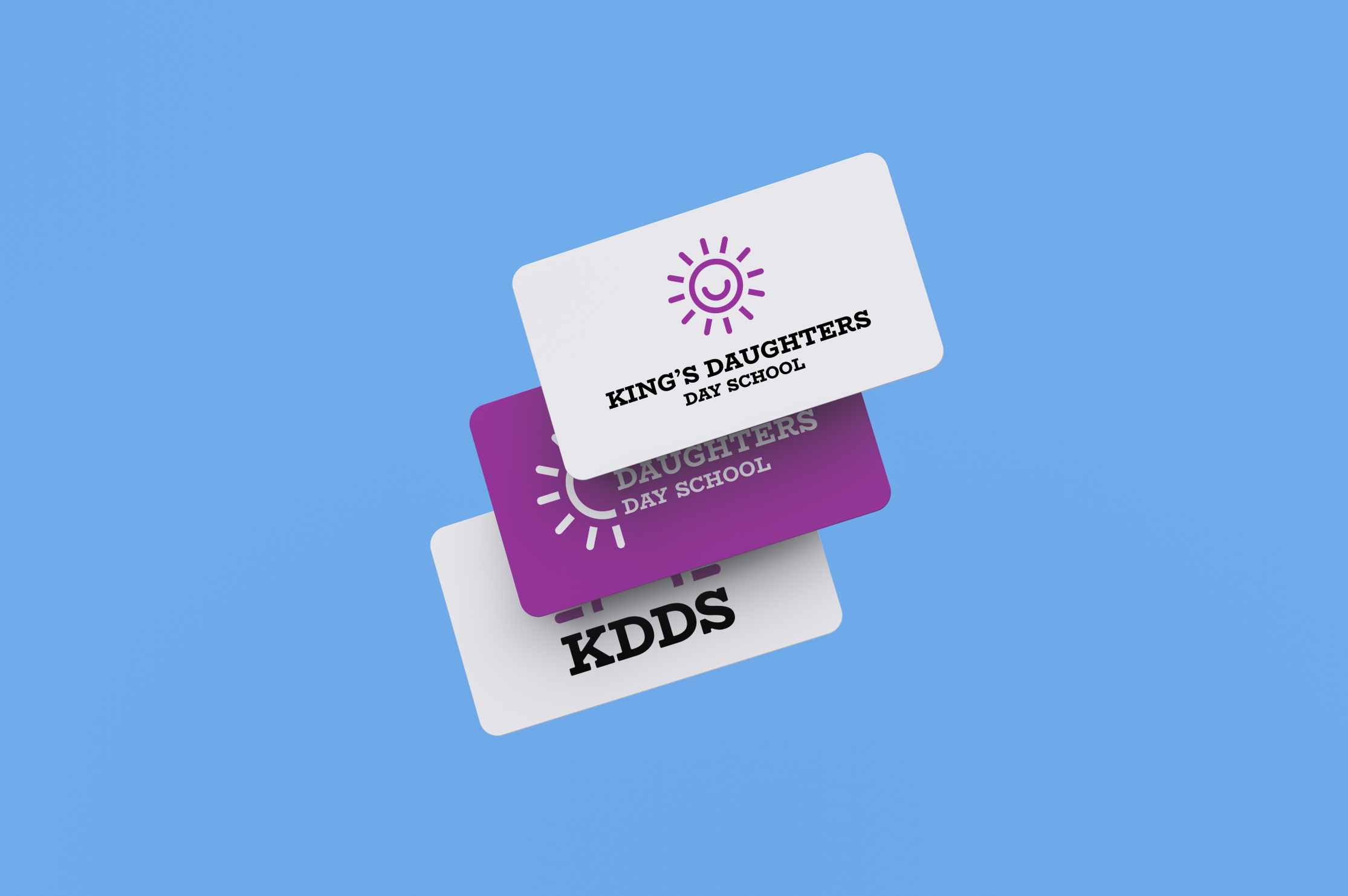
The project included refreshed logos across multiple formats, a cohesive brand system, and foundational brand guidelines. We also developed print materials such as a letterhead and business card template to support professional, consistent communication. A unique part of the process was the school’s involvement. Staff and parents participated in a live vote to select the final logo direction, ensuring the identity reflected not just the institution, but the families, educators, and students it represents.
The result is a fun, energetic brand system that feels authentic to the school’s values and supports future growth across fundraising, communications, and day-to-day materials.
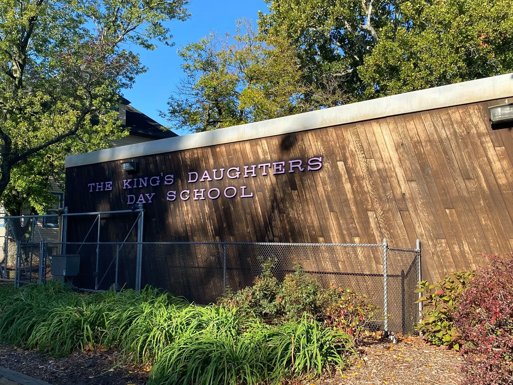
Seeing the school in person made a huge difference! The lettering on the building’s facade became a natural source of inspiration for the logo typography, helping the new identity feel connected to the space, the campus, and the community it represents.
There is a strong sense of pride in the building itself, especially as the school celebrates its 110 year anniversary. It was an absolute honor to be trusted with a project of such significance.
A range of logo concepts were explored to reimagine the school’s existing sun mark, which held strong recognition but presented legibility challenges. Each direction tested ways to preserve familiarity while introducing clearer typography, improved balance, and a renewed sense of energy. These explorations helped define a path that respected the school’s history while breathing new life into the identity, ultimately guiding the selection of a refined logo shaped by feedback and community involvement.
Key Learnings
Designing for a community
This identity needed to represent more than a single voice. Visiting the school and experiencing the classrooms, students, faculty, and surrounding town helped shape a brand that feels welcoming, inclusive, and reflective of the people it serves.
Participation builds ownership
Involving staff and parents in the logo selection process created early buy in and pride around the refreshed identity, reinforcing that the brand belonged to the community as a whole.


